

Visualizing Power Grids: Introducing Interactive Grid Visualizations in Power-Grid-Model-DS
By Thijs Baaijen, Alliander
In the complex world of energy grid modeling and simulation, a picture is truly worth a thousand data points. We are excited to announce that with our latest release 1.3 of Power Grid Model Data Science Toolkit (PGM-DS) in the Power Grid Model Suite, this release brings your distribution power grid models to life through powerful visualization capabilities.
The Power Grid Model and Power Grid Model Data Science Toolkit (PGM-DS)
The Power Grid Model , an open source initiative by LF Energy, provides a calculation engine for distribution power grids. It enables in-depth studies and analysis of the distribution power grid’s behavior and performance. This comprehensive model incorporates essential factors such as power generation capacity, electrical losses, voltage levels, power flows, and system stability. The Power Grid Model finds applications in various areas, including grid planning, expansion, reliability, and congestion studies. It has already been adopted by several organizations, such as Alliander, Enexis, and TU Delft.
Built upon the Power Grid Model, PGM-DS integrates data science into distribution power grid analysis, empowering operators, researchers, and scientists to simulate, analyze, and optimize distribution power grids more effectively.
The visualizer in PGM-DS
Imagine being able to instantly visualize the entire network you’ve been modeling; highlighting overloaded lines with a single click, identifying critical nodes at a glance, or dynamically exploring the relationships between different components of your distribution power grid. This is no longer just a wishlist item but a reality for all PGM-DS users.
Whether you’re planning grid expansions, conducting reliability studies, or making strategic investment decisions, seeing your data in a clear, interactive visual format can unveil insights that might remain hidden in code and arrays.
The new visualization feature builds upon the robust analytical capabilities of PGM-DS, creating a seamless bridge between complex grid calculations and intuitive visual exploration. Let’s explore what this means for your power grid modeling workflow.
Key features of the visualizer in PGM-DS
The PGM-DS visualiser brings powerful and intuitive network visualisation capabilities to the Power Grid Model project. With PGM-DS visualiser, users can easily explore, analyse, and interact with complex power grid networks directly within their Python environment. Below are some of the key features that make the visualiser a valuable addition to PGM-DS.
1. Support for multiple layouts: allows viewing and analyzing network structures from different perspectives, making it easier to identify patterns, relationships, and key components.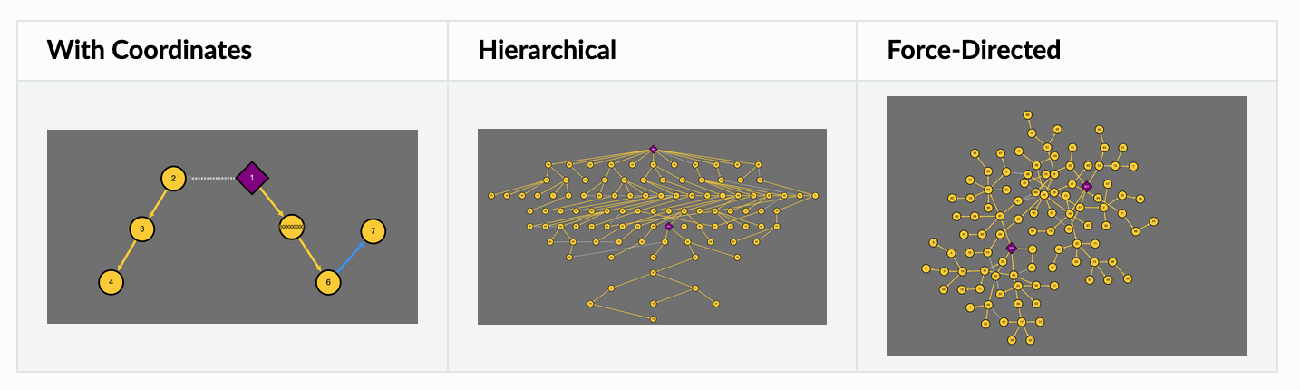
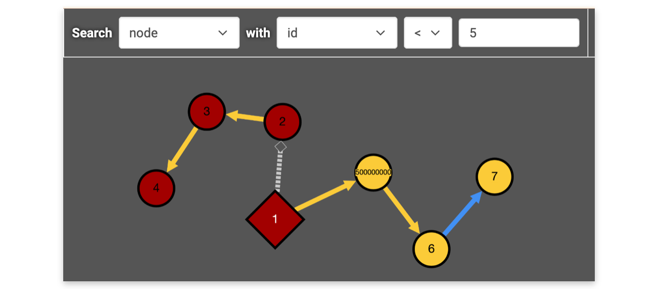
2. Highlighting nodes/branches by attribute values: This makes it easier to find specific nodes or features within a larger network.
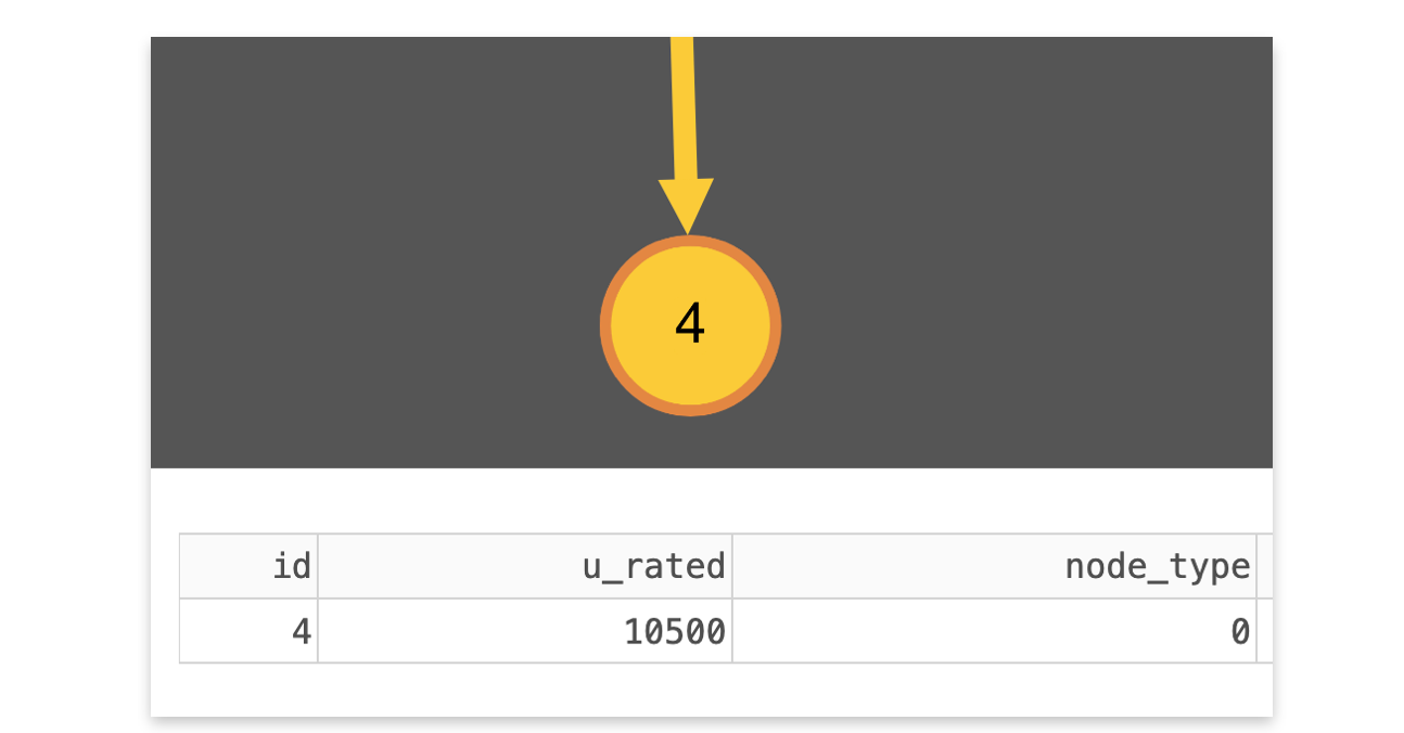
3. Detailed attribute views of selected components: To explore the grid more easily and investigate its components.
Choosing the right backend
The visualizer is based on the open source library dash-cytoscape, which combines Dash, a low-code python frontend for data visualizations, and cytoscape.js, a graph theory javascript library, into a single Python package.
After some research we opted for this particular backend combination for multiple reasons:
- Ease of maintenance: with dash-cytoscape, there is no specific javascript frontend to maintain, nor is there any need to write specific javascript code to incorporate js functionalities. This way, the PGM-DS project can remain a 100% Python project, which is both easier for maintainers and end-users.
- Feature-richness: while we’ve considered an alternative graph theory javascript library called js, we ultimately opted for cytoscape.js for two reasons:
- Besides other layouts, js also supports a (x,y) coordinate layout, whereas Sigma.js does not.
- js includes easy to implement functionality to highlight elements within a graph. This is especially useful when analysing larger graphs (e.g., looking for a specific node/branch)
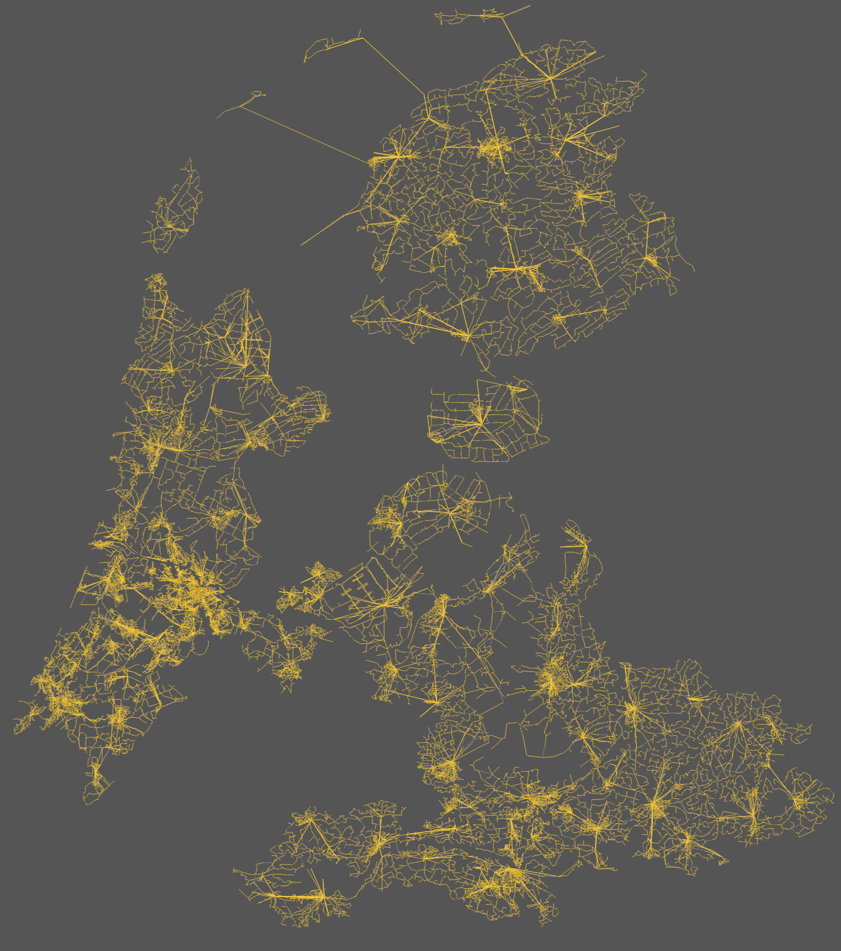
- Scalability: we’ve stress-tested the scalability of the visualizer by visualising the entire medium-voltage grid maintained by Alliander. This grid contains 80.000+ nodes and 90.000+ branches. While slow, it is still possible to visualize networks of this size (which can lead to pretty pictures).
Conclusion
In summary, we believe this release introduces a long-awaited and highly requested feature to the Power Grid Model suite. The new visualization capabilities make it easier for users to explore, analyse, and interact with complex power grid networks that underly energy grid modelling and simulation. We hope it enables users to do valuable work in the energy grid and energy transition domain.
For further documentation on using the new visualising features, please visit:
Visualizer — power-grid-model-ds documentation.
Want to transform your power grid analysis? Explore PGM and PGM-DS on the LF Energy website and browse the GitHub repositories to see what it can do. Stay in the loop by subscribing to the Power Grid Model mailing list – just send an empty email to: 📧 powergridmodel+subscribe@lists.lfenergy.org
This May we’ll host our annual Power Grid Model meetup, where we will also organise an interactive workshop to get a first introduction into PGM-DS. Want to join? Sign up here: 6th Power Grid Model Meetup 2025